![]()
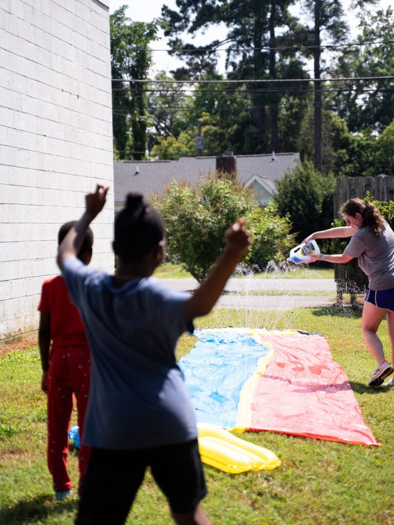
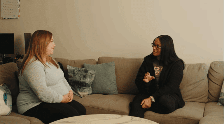
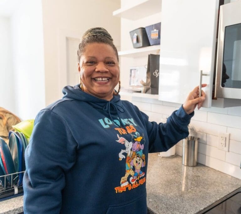
At Charlotte Family Housing, our mission has always been clear: to empower working families experiencing homelessness to achieve lifelong self-sufficiency. But recently, we had the chance to reflect not only on what we do, but how we show up in the world. Thanks to Wray Ward’s EmpoWWergrant, we were gifted the extraordinary opportunity to work with a dream team of creatives who helped us reimagine our visual identity.
We didn’t hate our old logo. In fact, it served us well. But it had lived a good life, and we were ready for something new—something that felt more alive, more aligned with the hope we want the families we walk with to feel.
The Wray Ward team of artists, graphic designers, and copywriters didn’t just dive in—they showed up. They visited our shelter. They walked our halls. They sat with us in long, thoughtful meetings and asked deep questions: Who are we? Who do we serve? What do we want people to feel when they interact with us? They listened and responded with creativity, compassion, and an incredible sense of partnership.
When it came time to explore design concepts, they gave us four completely unique directions. Some were simple and modern. Others centered more on the children and families we serve. None were dismissed. We brought together a committee of board members and staff, and we went back and forth (a lot!) before finally landing on the one that felt just right.
When we received the various logo drafts, they were presented on a spectrum from most similar to our old logo to least similar. Interestingly, we found ourselves drawn to the design that was furthest from our original—not because we wanted to abandon our past, but because we were genuinely excited about everything this new logo communicated. What we had always loved about our old logo was that it told a story, and this new design continues that tradition of storytelling in a powerful way.
This logo speaks to something much deeper than housing assistance. It communicates our true vision: upward mobility and seeing all families in our community not just survive, but thrive. Every element works together to illustrate a journey of hope, growth, and transformation. While our old logo served us well in representing our work, this new identity captures the full scope of our dreams for the families we serve and the community impact we’re working toward together.
We love our new logo for so many reasons:
The colors speak volumes too. They’re brighter. More hopeful. They feel full of possibility—just like the journeys our families are on.
We’re so grateful to the Wray Ward team for capturing the heart of who we are with such care and creativity. Our new logo is more than a design—it’s a story. And we can’t wait to keep writing it with all of you by our side.